Data grid
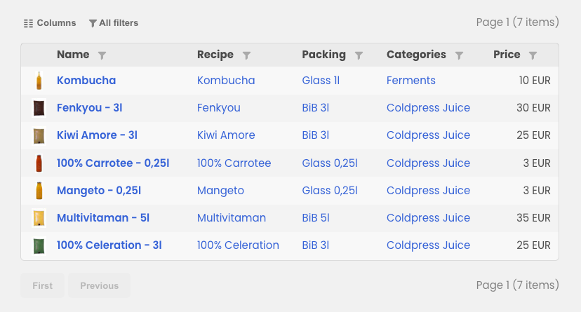
The data grid in Contember is simply a table. It allows you to display data from different entities, link to them and freely modify the data display in the cell. The data grid automatically creates filters (by data type) and paginate over each column for larger numbers of records.
Data Grid
The DataGrid is a wrapper for cell components.
<DataGrid
  entities="Article"
  itemsPerPage={50}
>
  <TextCell header="Title" field="title" />
  <TextCell header="Author" field="author.name" />
</DataGrid>
Props
| Prop | Description |
|---|---|
| string The name of the entity. You can use query language (Qualified entity list) to filter the entities. Required |
| Number The number of items you want to display on one page. Default is "all of them". |
Cells
Data grid in Contember supports these cells:
- Boolean cell
TheBooleanCellrenders yes/no for boolean values. And filters by them + N/A. - Date cell
TheDateCellrenders date values in a human readable format and filters by choosing from - to. - Enum cell
TheEnumCellrenders enum values in a human readable format and filters by the enum values. - Generic cell
TheGenericCellis useful to render any data you want in this cell. - Has many select cell
TheHasManySelectCellrenders a all the values of the related entity and filters by them. - Has one select cell
TheHasOneSelectCellrenders a single value of the related entity and filters by them. - Number cell
TheNumberCellrenders numbers and add filters for numbers (equals, greater than, smaller than) - Text cell
TheTextCellrenders text values and filters by them (contains, doesn't contain, matches exactly, starts with, ends with).
Boolean cell
The BooleanCell component adds a column for rendering boolean value.
<BooleanCell field="done" />
Props
| Prop | Description |
|---|---|
| string The name of the column in Contember schema where data is stored. Required |
| undefined | string Column's header |
| undefined | boolean If true column will try to be as narrow as possible given rendered data in the column. |
| undefined | boolean If false, the column can not be hidden. It is true by default. |
| undefined | boolean If true, the column cannot be ordered |
| undefined | Justification The justification of the column header |
| undefined | DataGridOrderDirection The initial order of the column |
Date cell
The DateCell component adds a column for rendering date (including filtering by date range and sorting).
<DateCell header="Created at" field="createdAt" />
Props
| Prop | Description |
|---|---|
| string The name of the column in Contember schema where data is stored. Required |
| undefined | string Column's header |
| undefined | boolean If true column will try to be as narrow as possible given rendered data in the column. |
| undefined | boolean If false, the column can not be hidden. It is true by default. |
| undefined | boolean If true, the column cannot be ordered |
| undefined | Justification The justification of the column header |
| undefined | DataGridOrderDirection The initial order of the column |
Enum cell
The EnumCell component adds a column for rendering enum values.
<EnumCell field="name" />
Props
| Prop | Description |
|---|---|
| string The name of the column in Contember schema where data is stored. Required |
| undefined | string Column's header |
| undefined | boolean If true column will try to be as narrow as possible given rendered data in the column. |
| undefined | boolean If false, the column can not be hidden. It is true by default. |
| undefined | boolean If true, the column cannot be ordered |
| undefined | Justification The justification of the column header |
| undefined | DataGridOrderDirection The initial order of the column |
Generic cell
The GenericCell component is a generic wrapper for cell content.
<GenericCell />
Props
| Prop | Description |
|---|---|
| undefined | string Column's header |
| undefined | boolean If true column will try to be as narrow as possible given rendered data in the column. |
| undefined | boolean If false, the column can not be hidden. It is true by default. |
Has many select cell
The HasManySelectCell component adds a column for rendering has many binding.
<HasManySelectCell header="Tags" field="tags" options="Tag.name" />
Props
| Prop | Description |
|---|---|
| string The name of the column in Contember schema where data is stored. Required |
| string | { label: ReactNode, value: OptionallyVariableFieldValue, description: ReactNode, searchKeywords: string | undefined }[] The options for the field. You can use query language to filter the entities. |
| undefined | (EntityAccessor) => ReactNode A function that is called to render the option. |
| undefined | string Column's header |
| undefined | boolean If true column will try to be as narrow as possible given rendered data in the column. |
| undefined | boolean If false, the column can not be hidden. It is true by default. |
Has one select cell
The HasOneSelectCell component adds a column for rendering has one binding.
<HasOneSelectCell header="Category" field="category" options="Category.name" />
Props
| Prop | Description |
|---|---|
| string The name of the column in Contember schema where data is stored. Required |
| string | { label: ReactNode, value: OptionallyVariableFieldValue, description: ReactNode, searchKeywords: string | undefined }[] The options for the field. You can use query language to filter the entities. |
| undefined | (EntityAccessor) => ReactNode A function that is called to render the option. |
| undefined | string Column's header |
| undefined | boolean If true column will try to be as narrow as possible given rendered data in the column. |
| undefined | boolean If false, the column can not be hidden. It is true by default. |
Number cell
The NumberCell component adds a column for number content.
<NumberCell field="likes" />
Props
| Prop | Description |
|---|---|
| string The name of the column in Contember schema where data is stored. Required |
| undefined | string Column's header |
| undefined | boolean If true column will try to be as narrow as possible given rendered data in the column. |
| undefined | boolean If false, the column can not be hidden. It is true by default. |
| undefined | boolean If true, the column cannot be ordered |
| undefined | Justification The justification of the column header |
| undefined | DataGridOrderDirection The initial order of the column |
Text cell
The TextCell component is a wrapper for text content.
<TextCell field="name" />
Props
| Prop | Description |
|---|---|
| string The name of the column in Contember schema where data is stored. Required |
| undefined | string Column's header |
| undefined | boolean If true column will try to be as narrow as possible given rendered data in the column. |
| undefined | boolean If false, the column can not be hidden. It is true by default. |
| undefined | boolean If true, the column cannot be ordered |
| undefined | Justification The justification of the column header |
| undefined | DataGridOrderDirection The initial order of the column |